Last Updated on June 3, 2019
eCommerce category pages are your money makers!
They bring in the most traffic, and have the biggest potential to significantly increase your bottom line.
However, they aren’t always easy to get right.
You may have noticed that sometimes you visit a store and it simply has a product list there with no real content…
While other pages will be full of images and links to different categories.
There’s a reason for this, and it has to do with the user intent of a keyword, and it’s essential to dig into this when forming your eCommerce pages.
But fear not, this guide will help you get it right, every time.
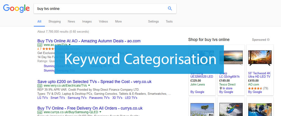
How to categorise your keywords based upon user intent?
So the simple question you need to ask is this:
What are my users looking to achieve by searching for this keyword?
Then you can deduce how your page should be structured to best serve the various intentions of the user.
But what can you use to work this out?
My favourite ways to compile this information are:
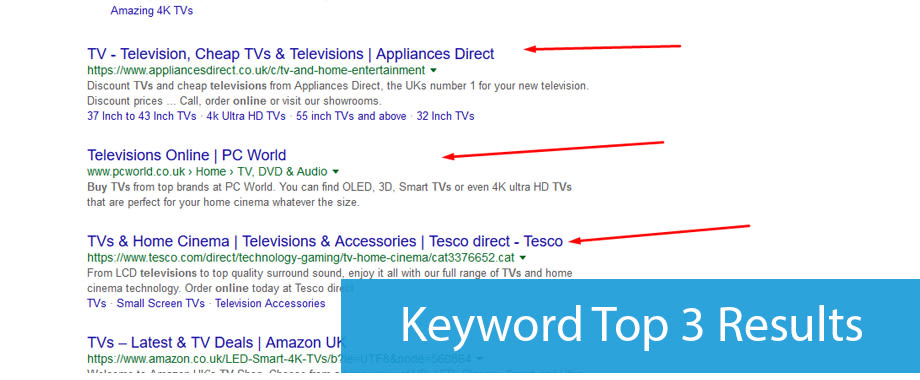
1. The #1-#3 in the Google search results
RankBrain automatically determines the pages that the users value the most, and ranks them highest in the results.
This means the top 3 results should already be structured in a relatively good way for the user to find what they’re looking for, and so you should note down each of the user intentions served, particularly above the fold.
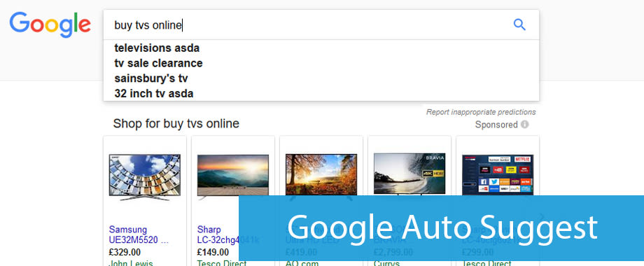
2. Google auto suggest
These are the common searches that people make around the topic, that many people doing the initial search will want the answer to.
You can find them by entering in the search box your keyword, followed by a space and another letter, for example “buy tvs a”, which would show auto suggest results that are best matched to that combination of keywords / letters, such as “buy tvs australia”.
Go through each letter of the alphabet to create a comprehensive list, or use an automated tool such as Uber Suggest.
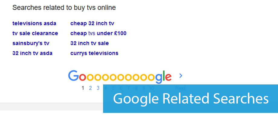
3. Google related searches
This is often where you will find people refining their searches because the initial results did not fit their needs
It can be found at the very end of the search results, where there will be a list of 8 links.
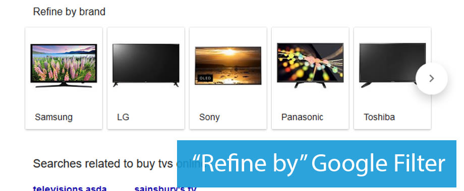
4. NEW Google “Refine by” Section
You may have seen this appearing in the Autumn of 2017, with a row of images that suggest users to refine their search by a certain category.
This is an indication of the most popular way searchers of this term tend to want to navigate by, and so it should be the key user intent served on your category page (if it appears in your SERPs).
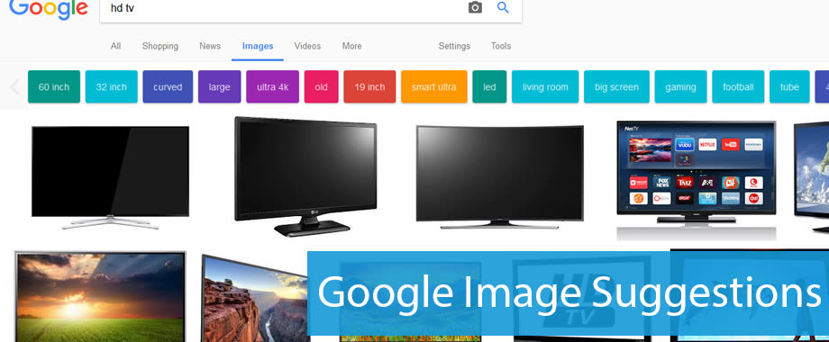
5. NEW Google Image Suggested Search
A new feature within Google images will suggest related phrases in coloured boxes when you search for keywords within Google image search.
These can help you understand which visuals people are expecting, and also further user intentions that you may not have picked up elsewhere.
The Next Step: Cluster User Intents
Now you should have a comprehensive list of keywords heavily related to your category topic, along with the intentions served by the top 3 in the SERPs.
Now you need to cluster your keywords based upon user intent and add them to your intents listed from the top 3.
This will create a small selection of intents that you can aim to serve in your eCommerce category page.
3 Types of eCommerce Category Page Layouts
One you have your user intents, you should come to one of three conclusions for the layout of your page:
- A product list with specific filters.
- A navigation page with multiple sub-category / information links.
- A mixture of the two.
The following examples will aim to provide some clarity on which to choose.
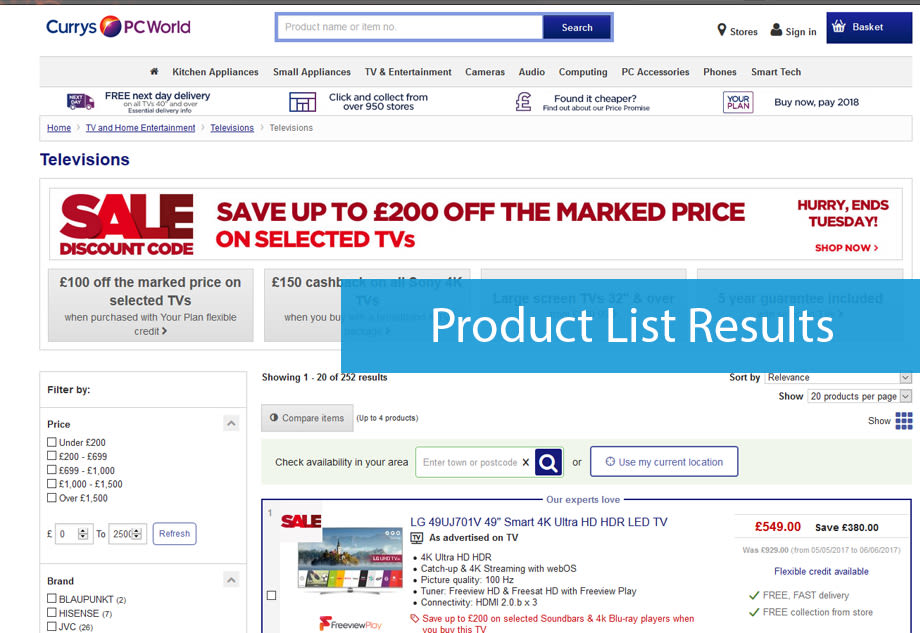
Example #1 – “32 inch tvs” – Product List and Filters
In this example we search for the phrase “32 inch tvs”.
Our top 3 results are from Tesco, Argos, and Currys. Each of these has a list of Televisions with a filter bar to the right hand side.
This suggests that the searchers of this keyword prefer that category page layout, and so our page should have a similar format of produts and filters.
The suggested searches show that Price is important to the user (sale and cheap).
The “refine by brand” section suggests that brand of TV is an important filter for the user.
We could conclude that the most prominent filters on our list page should be the Brand and Price of the TVs, and funnily enough these are the top two filters for each of the top 3 results.
Example #2 – “buy tvs online” – Navigation Page
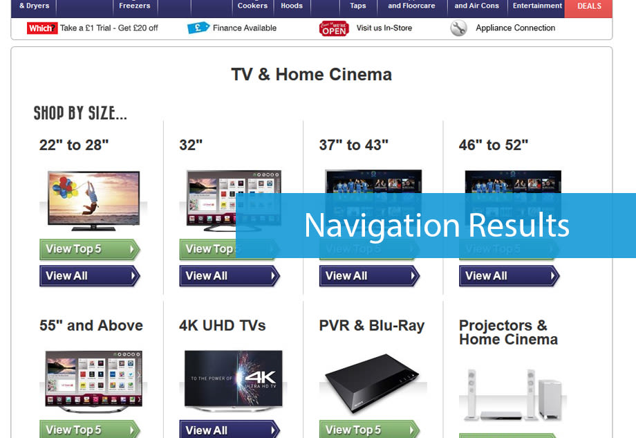
In this example we search for the keyword “buy tvs online”.
We can see from the top 3 results that the pages are focused on navigating the user to a more specific category for their needs (which makes sense as it’s quite a generic search). They focus on areas such as price, size, features, and brands.
So we should aim for our category page to have this navigational layout, and focus on quick and simple navigation to each of these areas.
From the related searches, we can see that price and size are a major factor. Perhaps having a best price, or deals link could serve these users best, having that above the fold may reduce your bounce rate.
From the “refine by brand” section we can see that many users want to filter this result by the brand of television.
One of the auto suggested phrases was “and pay later”, suggesting financial options could be valued by the searcher. Perhaps a banner mentioning finance options would reassure the visitor above the fold.
Mixed Scenarios
Mixed category pages often come around when you get deep into a niche, and usually it’s when a keyword has both commercial and informational intentions mixed together.
In such cases you can summarise the informational content (using concise headings and structured data to hopefully get a rich snippet result) and have recommended products for the related content below this.
User Experience on Mobile
This is one of the make of break issues in eCommerce websites, the way users interact on mobile phones.
You will have less time to satisfy the user before they bounce or become distracted, so everything must be tap friendly and above the fold.
Remove all content that doesn’t pass value, make the website header as small as possible (while still retaining key icons such as basket, search and call), and add your most important navigational or filter options as the first things after the title of the page.
You want to allow the user to filter multiple times so the results they are left with are small, hyper focused to their intent.
Changes Over Time
One final thing to consider is that user intents can change significantly over time, and this can be one of the reasons why a number 1 listing can drop off to number 4 – 9, because the intent has shifted and the page hasn’t adapted.
If you notice ranking drops from previously top 3 ranking pages, consider redoing your analysis of the phrase to ensure you’re still a good fit for it.
Final Thoughts
Of course the thing that can confirm or dispute these changes are your Google analytics statistics, so doing split tests and monitoring the user engagement with your page, as well as the conversion rates should help you to deduce which type of page is preferred.
Agree?
Disagree?
Need a question answering?
Comment below!



This Post Has 0 Comments